I recently gave a webinar session on website UX for libraries as part of the cool SEFLIN Virtual Conference that went on last week. Here are my slides from my session – enjoy!
Website Redesign going live and going Responsive
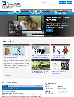 Well, I didn’t really post much about my library’s website redesign. But next week, we go live with it!
You can check it out now at our beta, pre-launch URL – dev.tscpl.org.
Here’s our go-live process:
- Work on the site like crazy (we still have a big list of stuff to do!)
- Today, we posted a head’s up to our customers, and asked them for feedback, too
- We go live on January 29
- Then, we’ll continue to tweak things as we notice them for 2-4 weeks.
- Sometime after the big launch, we plan to have Influx take a peek, to catch stuff we missed.
- Finally, we plan to do some usability testing to catch even MORE stuff we missed.
So, what’s new and different about our redesigned site? Quite a bit:
- We went responsive, so one set of code works on all browsers and devices.
- We have consolidated some of our blogs
- Really worked hard on our links, our navigation, and directing people to the right content
- Modern design, modern web fonts, white space, etc
- On the back-end, we focused on letting WordPress do most of the work, instead of custom-coding. This will make things like sidebar widgets and pages MUCH easier for us to update
And probably much more that I’m missing. So go check it out!
Web Design Trends for 2014
I recently presented this talk at Internet Librarian 2014, and wanted to share it here too! If you want to see some really good notes from my presentation, check out Sarah Houghton’s post (thanks, Sarah!).
I did some research via Google on web design trends for 2014, took the trends that reappeared a bunch, and … here they are: 15 Web design trends in 6 loose categories:
Category 1 – Mobile:
1. Mobile-first design. Start designing on the small screen, then widen out to tablets and desktops. If you can’t do it on a mobile device, you probably don’t need it on your “big†website, either.
2. Responsive. Use a responsive or adaptive design, so your website works great on all screen sizes.
Category 2 – Designy Things:
3.Simplicity. Many web designs are going for a more minimalistic, simplified look. Make sure the design doesn’t get in the way of, or overpower, your great content.
4. White Space. Goes along with simplicity. White space can help emphasize content. Use it just like they do it magazines.
5. No Flash. Websites are still working on moving away from Flash and towards more modern design languages like HTML5 and CSS3.
Category 3 – Visual:
6. Parallax. Parallax design is a way to provide design depth and almost a 3D look to your website. IT reminds me of layers in Photoshop … just done on websites.
7. Flat Design. Sorta funny. Flat design and parallax design are almost opposites (but not quite). Flat design focuses on clean design and good use of color and whitespace. Think the new iOS design, and you’ll get the idea.
8. Blocking. Blocks of content – think Pinterest. I think it works great on sites like Pinterest or Flickr, where there’s a ton of content and the content is all on equal footing. On library websites like New York Public Library’s main page? Not so much. I’d guess their content is NOT equal in terms of importance, and the bottom of the page looks like an afterthought, like they forgot to “finish†the website.
9. Big Images. Use of large images on websites is a trend at the moment – even having a large image in the background of a website.
10. Colors. Using colors is big, apparently. Depending on what “hot web trends for 2014†you read, you’ll get a variety of answers as to what colors are trending – subtle and calm colors, retro colors, even neon colors! But know that web design is “colorful†these days. So think about using a tool like Adobe Kuler to help choose popular colors for a website. Or just go to Home Depot and get some matching paint swatches, and use those as a color base for your website.
Category 4 – Typography:
11. Web Fonts. We’re no longer limited to a couple of web-safe fonts. Think about using new web fonts like Google Fonts or Typekit.
Category 5 – Content:
12. Video. Video is still growing in importance. A recent Pew report on online video says that 78% of online adults now watch or download video content. It’s an easy way to provide viewable content on your website.
13. Social Media. Social media integration is important for all types of websites and organizations. It’s a great way to share content out to customers in all the online “places†they hang out at.
Category 6 – Navigation:
14. Large Buttons. Websites are starting to use large, easily seen buttons. Make them big and bold!
15. Vertical Scrolling. Think about using “sticky†navigation that glues itself to the top of the page, or social media sharing plugins that glue themselves to the side of a page.
There you go! 15 web design trends for 2014. Are you redesigning your website? We are! Please share your new design ideas!
Website Redesign Time!
My library is in the beginning stages of another website redesign. Our beginning thoughts were simply that we wanted to move to a responsive site design, to help out our mobile website visitors (hitting 20% and growing).
Then we realized all that back-end re-coding work pretty much meant a complete redesign. And there are some other things we want to address and improve, so doing a redesign makes sense.
I thought I might post once in awhile about the redesign process. Could be interesting…
What have we done so far?
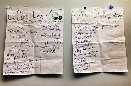
- I met with a group of customers, and asked them what they wanted in a website (see the image in this post for the notes on that session – here’s the Flickr link to it)
- held some meetings with our Creative Group and our web team
- created some early, rough draft mockups of the site – a main page, a blog post, and a mobile version of the main page.
Today, we kicked off a series of staff brainstorming meetings. In these meetings, I introduce the concept of responsive design, give some reasons why we are redesigning, and show off our mockups. Then, we brainstorm on these questions:
- What do you like about the current website?
- Where do customers get stuck when using the website?
- What’s missing on our website?
- What do you think can be improved?
Once these meetings are done, the next step will be to summarize the brainstorming sessions, and present that to our leadership team. Assuming that goes fine, then the website coding starts in earnest.
Should be a fun time!
Find & Fix your Potholes
 Does your website, your library, or your new service have “potholes?”
Here’s what I mean by potholes – on your website, if the navigation is unclear, or if that “what do I do next” thing doesn’t make sense, you have caused a customer to stumble. You have effectively placed a pothole in your customer’s path, making it harder for them to navigate towards whatever it is they wanted to do.
Not a good thing!
A physical library building can do that, too. Poor (or non-existing) signage in a building can make people stumble. Arranging your book collection in a “made sense at the time” way can cause people to stumble.
If a new library service is confusing, has too many rules and policies surrounding it, or if information about the new service is hard to find on the website – again, these things make our library customers stumble.
A great way to increase usability – and hopefully satisfaction for our customers – is to find and fix those potholes. How do you do that? Here are some suggestions:
- do some usability testing for the website.
- ask customers if they can easily find things in your building.
- keep track of frequent questions at the reference desk (i.e., those “where’s the bathroom” questions could mean that you have a new customer, or it could mean your signage stinks. Or both).
- Create a “No” list – keep track of every time staff have to say “no” to customers. Then see if those “no” answers can be turned into “yes” answers with some policy tweaking, etc.
Then fix those potholes, so your customers don’t stumble.
What makes your customers stumble?
Pothole pic by Andy Wilson